
Contents7
2026-05-16 update: A post from a few years back. The bones still hold up, but the UI screenshots and Figma version are from when it was written and don’t match the current build.
This post walks through the Figma basics, part 2.
I covered getting up to a design file in the earlier posts, so use those as a starting point.
Related: How to use Figma — setup / How to use Figma — basics, part 1
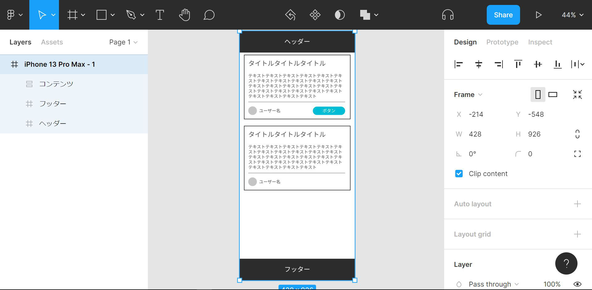
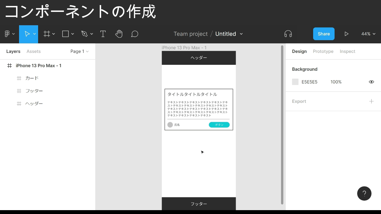
The finished design from this post looks like the image below.
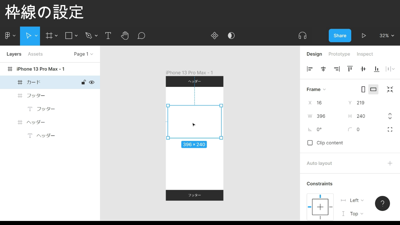
Setting a stroke
The earlier post stopped at the header and footer.
This time I start with the cards inside the content area.
The GIF below begins right after the frame has been created.
Point
- Select the element you want to add a stroke to
- Find the Stroke section in the right panel
- Click the + icon to the right of Stroke
- Click the color code that appears below
- Pick a color from the picker, or from the swatch history under it
- Set the line thickness with the number next to the three-line icon under the color code
That’s the stroke set.
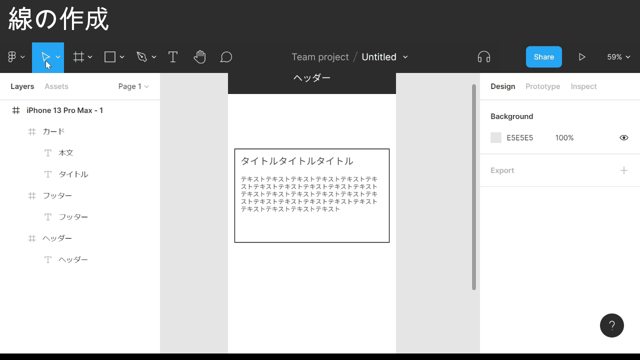
Creating different elements
With the card outline in place, the next step is the contents.
I drop in a title and body text as shown in the GIF below.
Then a divider line and an avatar icon underneath, both made from primitive shapes.
Point: drawing a line
- Click the ∨ next to the rectangle icon in the toolbar
- Pick Line from the list
- Move the cursor to where you want the line to start
- Drag to set the length
Point: drawing a circle
- Click the ∨ next to the rectangle icon in the toolbar
- Pick Ellipse from the list
- Move the cursor to where you want the shape
- Drag to set the size
- Snapping kicks in around centers and edges
- Hold Shift while dragging to lock the X or Y axis
The divider and avatar icon are now in place under the content.
Grouping
The card frame is starting to hold a lot of elements, so I bundle them.
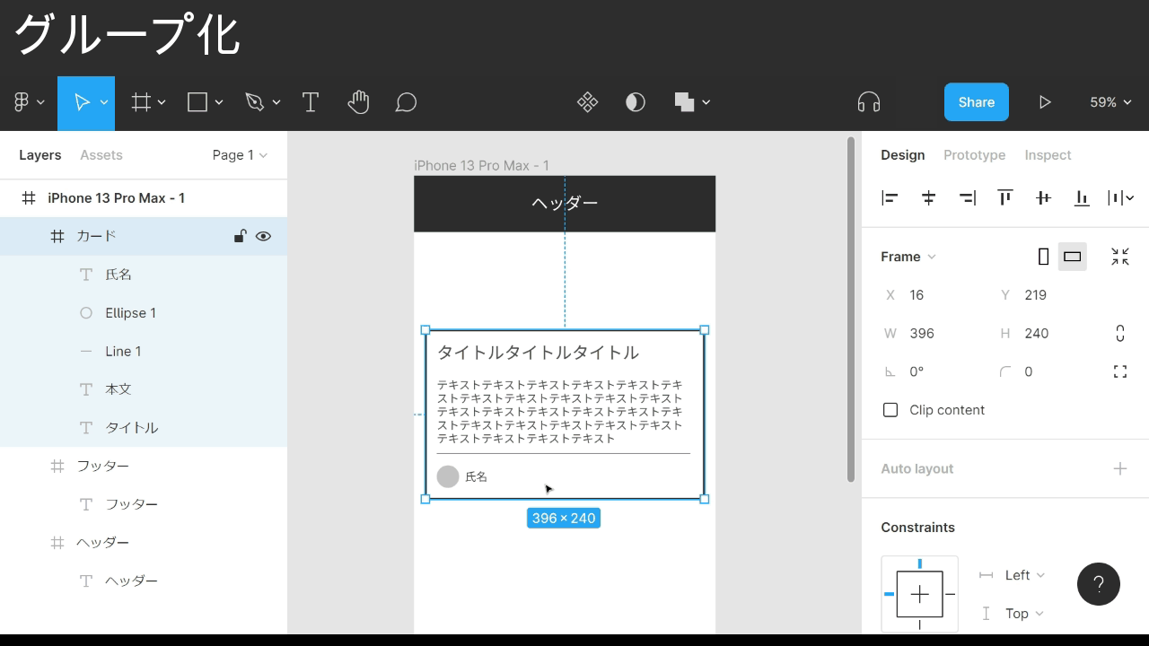
Point
- Select the elements you want to group (multi-select)
- Right-click to open the menu
- Choose Group selection
- In the left panel you can Shift-click to select a range
- With elements selected, Ctrl + G also groups them
The card elements now live inside one group.
Changing the corner radius
The last piece inside the card is a button next to the avatar icon.
I drop a frame next to the avatar and give it a background color.
I want rounded corners on the button, so I round it off here.
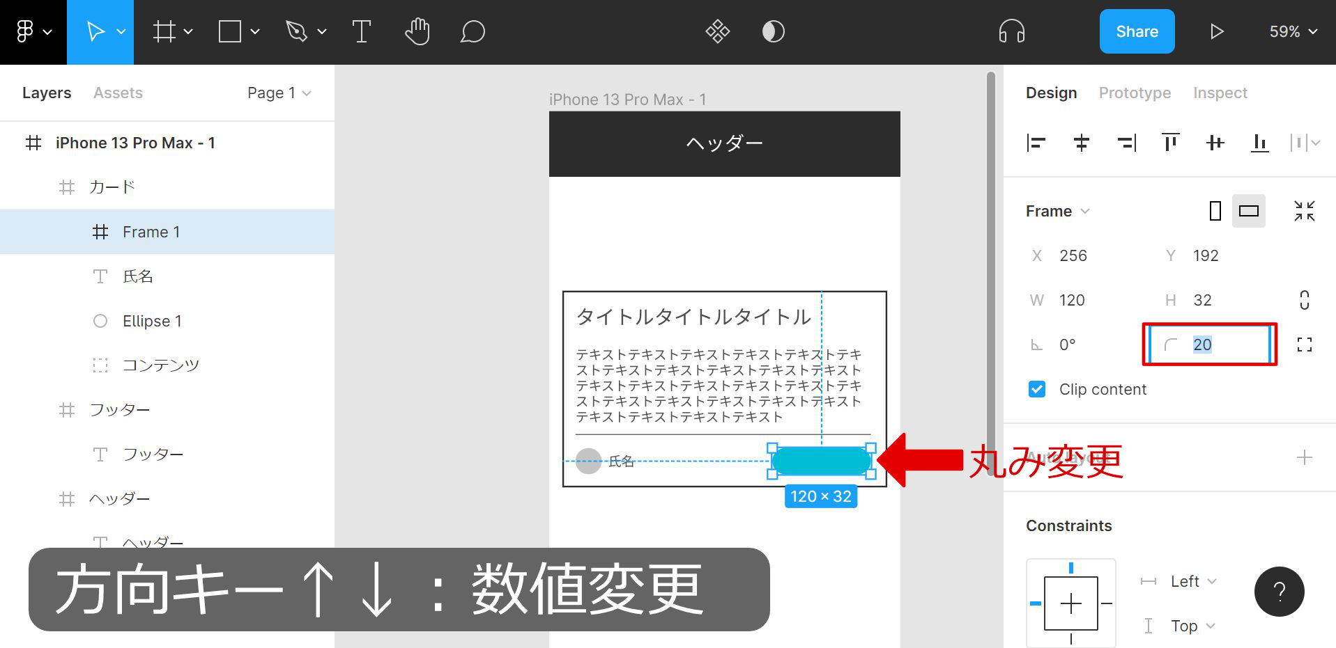
Point
- Select the element you want to round
- Find the Frame section in the right panel
- Click the number inside the red outline on the Frame row
- Type the value you want
- Arrow keys ↑↓ nudge by 1 pixel
That’s all the pieces inside the card built.
Creating a component
Cards usually appear more than once, so I duplicate it.
But instead of plain copy-paste like last time, I use Figma’s component feature — a stronger form of duplication.
Point
- Select the elements you want to turn into a component
- Right-click to open the menu
- Choose Create component
- With elements selected, Ctrl + Alt + K also creates a component
As the GIF shows, components do a few useful things at once:
- Edits to the master component flow through to every instance
- Per-instance overrides (no effect on the master)
- Toggle visibility per element
- Override text per element
Turning frames you’ll likely reuse into components — and reaching for them by default — is one of the biggest payoffs Figma gives you later.
Adding auto layout
At some point I want to swap the button label for something longer.
This is where auto layout comes in.
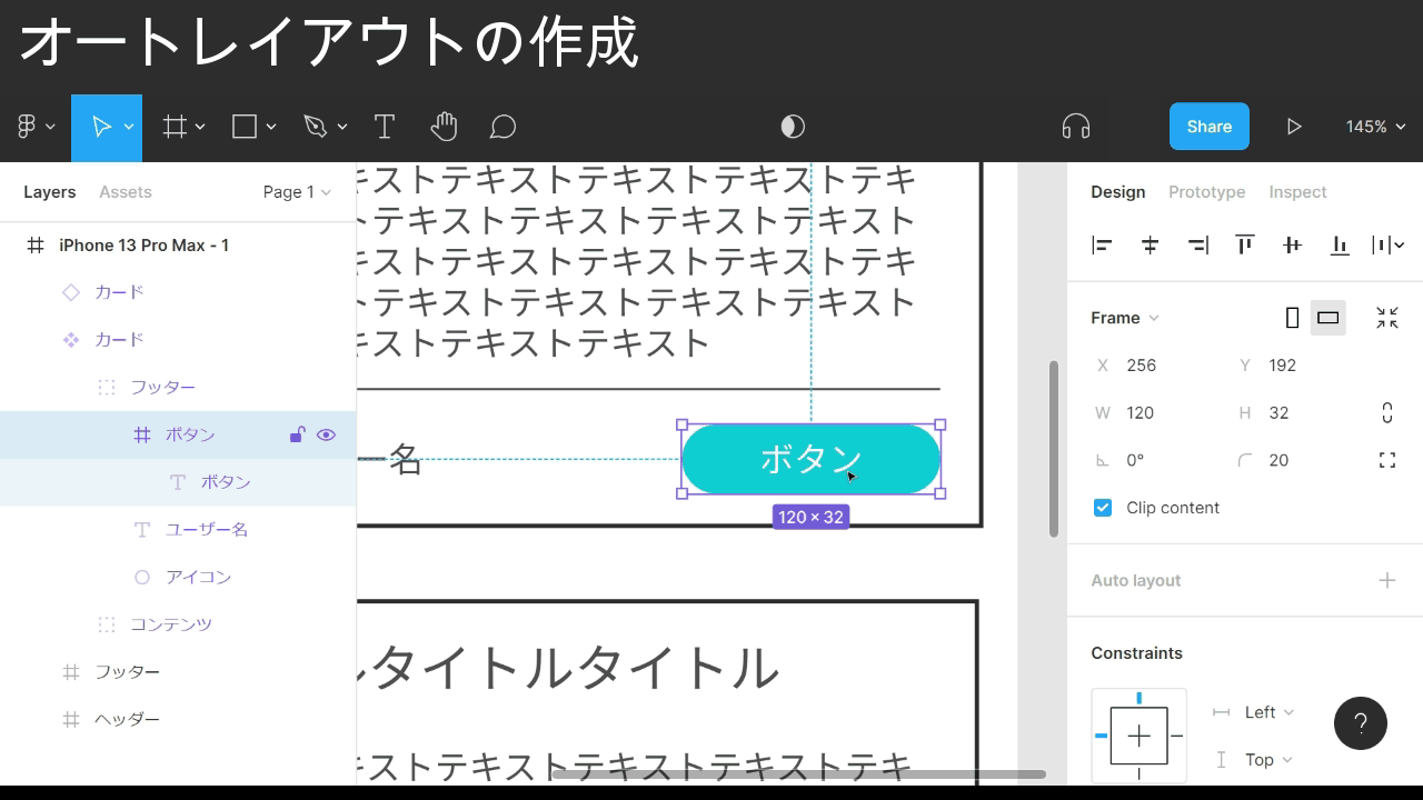
Point: turning on auto layout
- Select the element you want auto layout on
- Right-click to open the menu
- Choose Add auto layout
- With elements selected, Shift + A also enables auto layout
Normally, longer text would overflow the frame. With auto layout, as the GIF shows, the padding on all four sides stays put.
Reach for auto layout when an element’s width or height needs to grow with its content.
The button in that example grows to the right, which eats into the right-side margin.
One more tweak keeps the right margin intact while the button still grows.
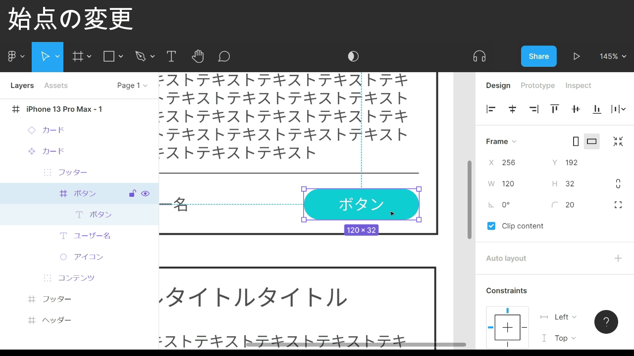
Point: changing the start point
- Select the element whose start point you want to change
- Find the Constraints section in the right panel
- In the small diagram, click the blue lines to set the start point
The button’s auto layout now anchors to the bottom-right, so the right margin stays put as it grows.
The labels (left, right, etc.) next to the diagram set the same thing if you prefer text.
Auto layout has another useful piece.
I use it here to set the padding around each card and the gap between cards.
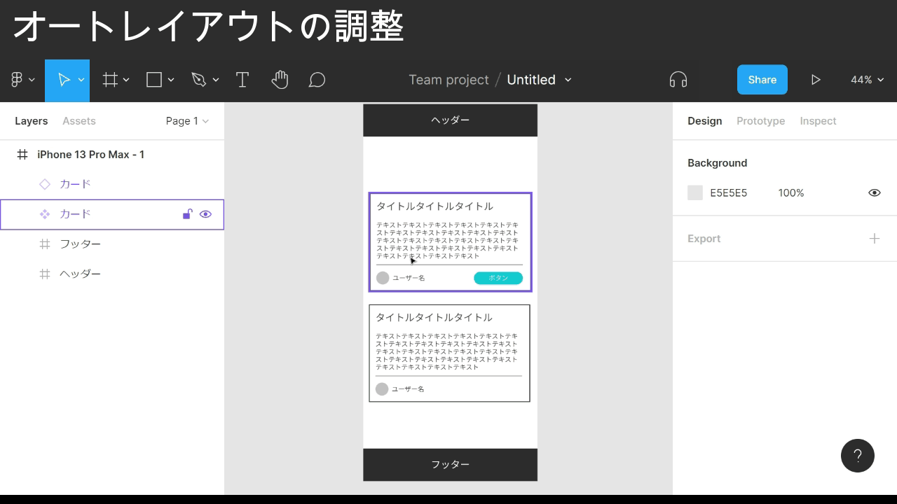
Point: adjusting auto layout
- Multi-select the elements you want under auto layout
- Enable auto layout
- Find the Auto layout section in the right panel
- Click the rightmost square in the Auto layout row
- Adjust the top / bottom / left / right padding in pixels
- Click the three-line icon
- Adjust the gap between elements
The Auto layout section in the right panel handles padding and spacing.
When the same element appears more than once, auto layout makes it easy to dial in outer padding and inter-element gaps in one place — worth reaching for by default.
The finished design
That covers Figma basics, part 2.
Next up: the features that make a Figma file easier to maintain over time.
Related: How to use Figma — basics, part 3