
Contents6
2026-05-16 update: A few years on from the original. The skeleton still holds up, but the tool UI and version match when it was written and differ from the current Figma.
This post covers the Figma features that make a file easier to manage and easier to adjust.
Building up to the design file itself is covered in the earlier posts, so use those as the starting point.
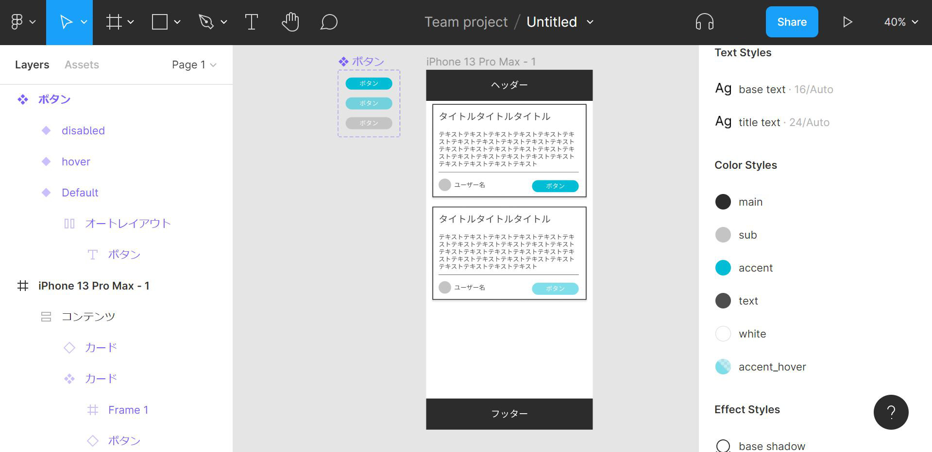
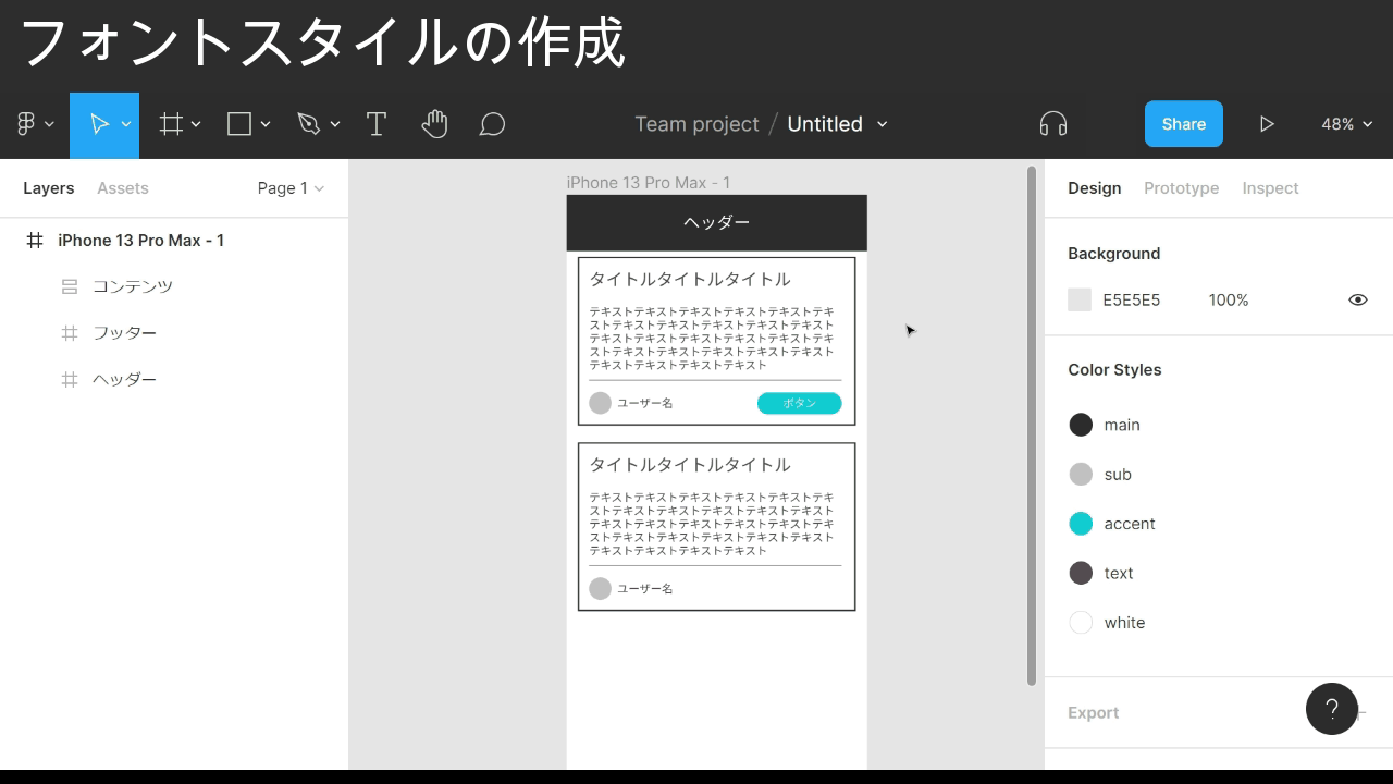
The finished design from this post looks like this.
Create a color style
The screen elements are already in place from the earlier parts, so the next step is to register the colors and make them reusable.
Start with the header background color.
Point
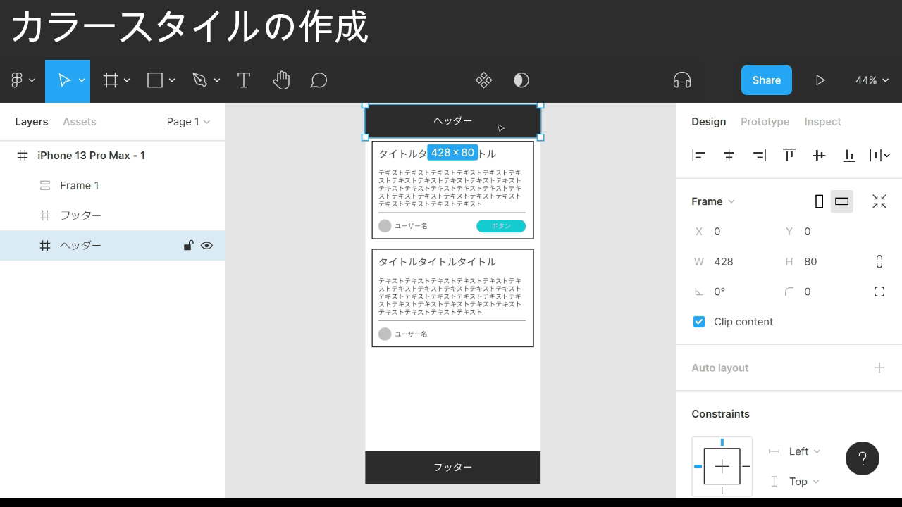
- Select the element whose color you want to register
- Find the Fill section in the right sidebar
- Click the four-dot icon to the right of Fill
- Click the + icon to the right of Color Styles
- Type the name you want to register in the modal input
- Click Create style
That’s the color registered.
Registered colors pay off in places where the same color is reused across elements.
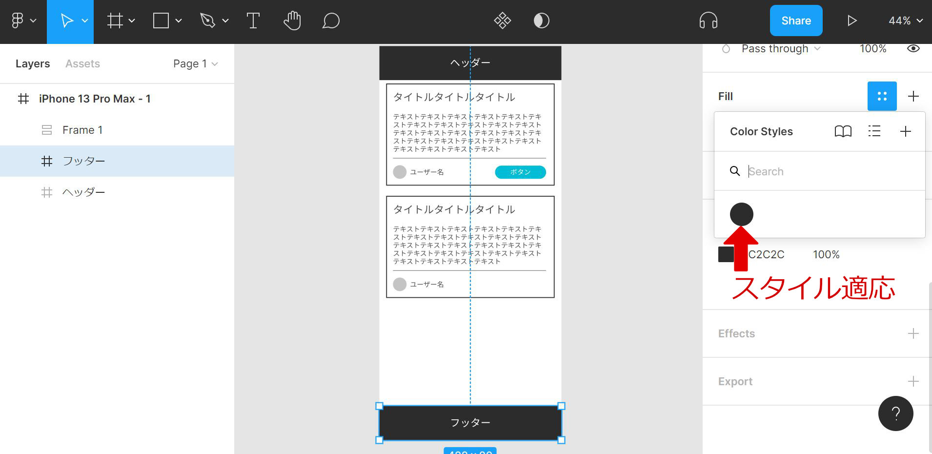
The header background color is also used for the footer background, so apply the style we just registered to the footer.
Point
- Select the element you want to apply the registered color to
- Find the Fill section in the right sidebar
- Click the four-dot icon to the right of Fill
- Under Color Styles, click the color you want to apply
The registered footer color is now in place.
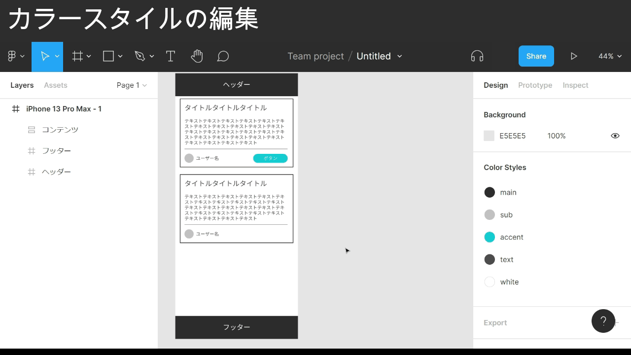
Registering each color in Color Styles and applying it everywhere makes color changes much easier later on.
The GIF below edits the main color while every other color and element is already mapped to Color Styles.
Point
- Click an empty area with no element selected
- Find the Color Styles section in the right sidebar
- Hover over the color you want to edit in Color Styles
- The adjust icon appears on the right — click it
- The color code shows below — click it
- Pick the color you want in the color picker
As a design tightens up, the urge to fine-tune colors goes up too, so registering colors early tends to save time.
Color Styles also surfaces which color is doing which job and how many times each one is used, which makes it less likely an odd color slips in.
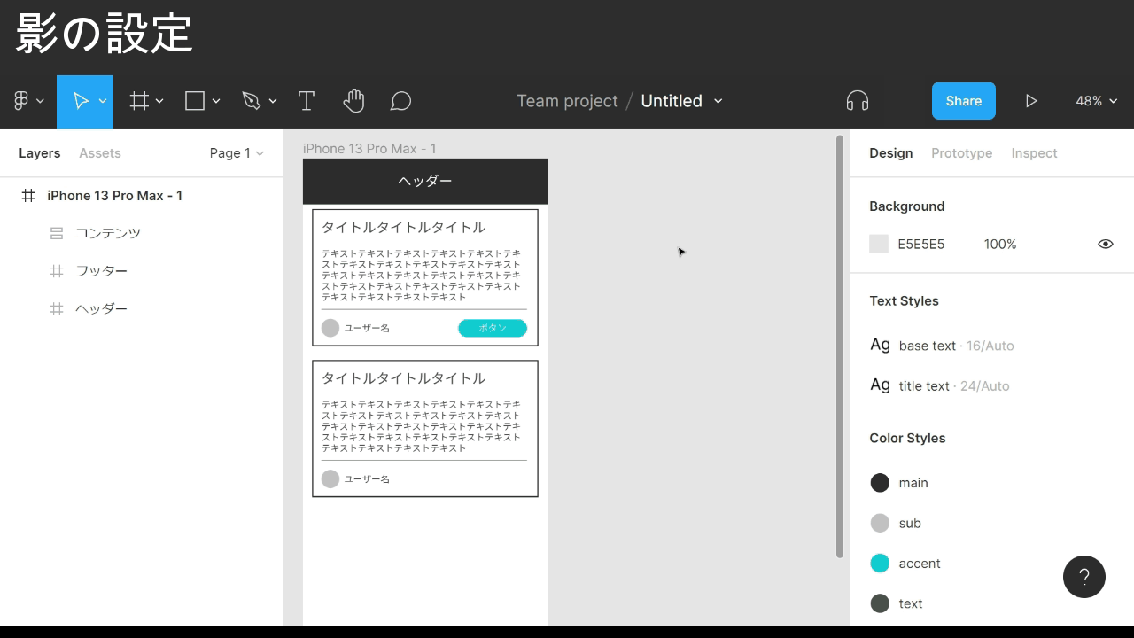
Create a font style
The same kind of registration exists for font settings.
Point
- Select the element whose font you want to register
- Find the Text section in the right sidebar
- Click the four-dot icon to the right of Text
- Click the + icon to the right of Text Styles
- Type the name you want to register in the modal input
- Click Create style
The font style is now registered.
Applying and editing a font style works the same way as Color Styles.
Set up the shadow
So far this has been about manageability. Next, add a shadow to an element.
The card frame is a good test case.
Point
- Select the element you want to add a shadow to
- Find the Effects section in the right sidebar
- Click the + icon to the right of Effects
- Click the sun icon to the right of Effects
- Adjust the values under Drop shadow until they look right
- Arrow keys (↑↓) nudge by 1 pixel
The card frame now has a shadow.
Shadows can be saved as a style the same way.
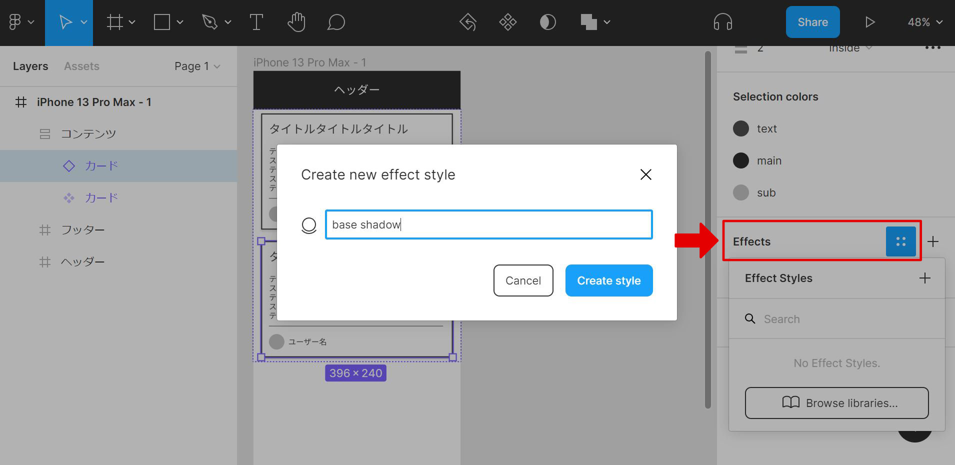
Point
- Select the element whose shadow you want to register
- Find the Effects section in the right sidebar
- Click the four-dot icon to the right of Effects
- Click the + icon to the right of Effect Styles
- Type the name you want to register in the modal input
- Click Create style
The shadow style is now registered.
Applying and editing a shadow style works the same way as Color Styles.
Combine components with auto layout
A button on a real web page changes color or content the moment it’s clicked.
To express those state changes inside Figma, the Variants feature is the right tool.
As things stand, Variants is awkward to use, so the prep step is to keep auto layout on the button and turn it into a separate component.
This section originally included a roughly 32 MiB GIF showing the component-plus-auto-layout operation. It’s been dropped because of the hosting (Cloudflare Pages) file size limit. For the actual behavior, see the Figma official documentation.
Point
- Select the element you want to turn into a component
- Move it outside the frame
- Wrap in this order: component / auto layout / element
- If the top of the element is a frame, add auto layout to it
- Move the child component back to where it was in step 1
The flow is a bit involved, but the button is now a component with auto layout intact.
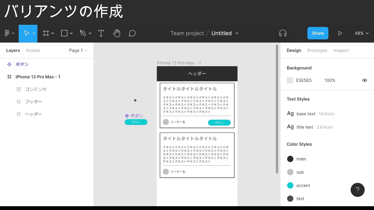
Create variants
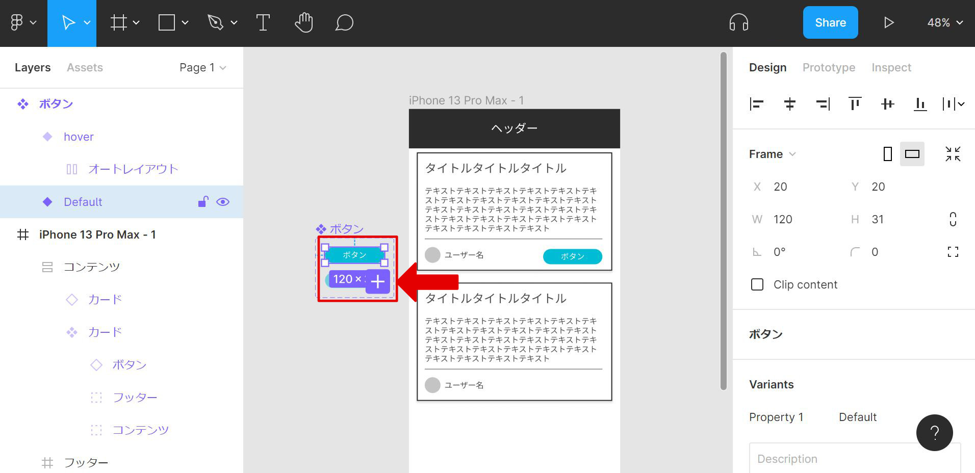
A button is now ready outside the frame as a component.
From here, use Variants to express the button’s state changes.
Point: applying variants
- Select the component-ised element you want to add variants to
- Find the Variants section in the right sidebar
- Click the + icon to the right of Variants
- In the input field showing something like “Variant2”, type the sub-state name you want to register
- Select the elements inside that state
- Change colors or other properties
Point: switching variant state
- Select the element whose state you want to change
- Find the section in the right sidebar that shows the component name
- Click the dropdown next to something like “Property1”
- Pick the state to switch to
Adding variants outlines the component with a dotted border and duplicates the element.
Editing those duplicates is how the sub-states get expressed.
One caveat: Variants only applies to elements that are already components.
By default only one variant on top of the default can be registered, so add another state.
Point: adding a variant
- Select the variant element you want to add another from
- A + icon appears nearby — click it
New variants get added directly below the selected element, so starting from the bottom-most variant tends to keep the layout clean.
Finished
That’s part 3 of the Figma basics.
More skill-related posts to come.